During the pandemic people are wearing masks in public to prevent the spread of the virus. In coffee stores, the environment's noise and the limitations of masks make the communication between customers and baristas more challenging. The goal of this project is to improve the coffee ordering communication through an App.
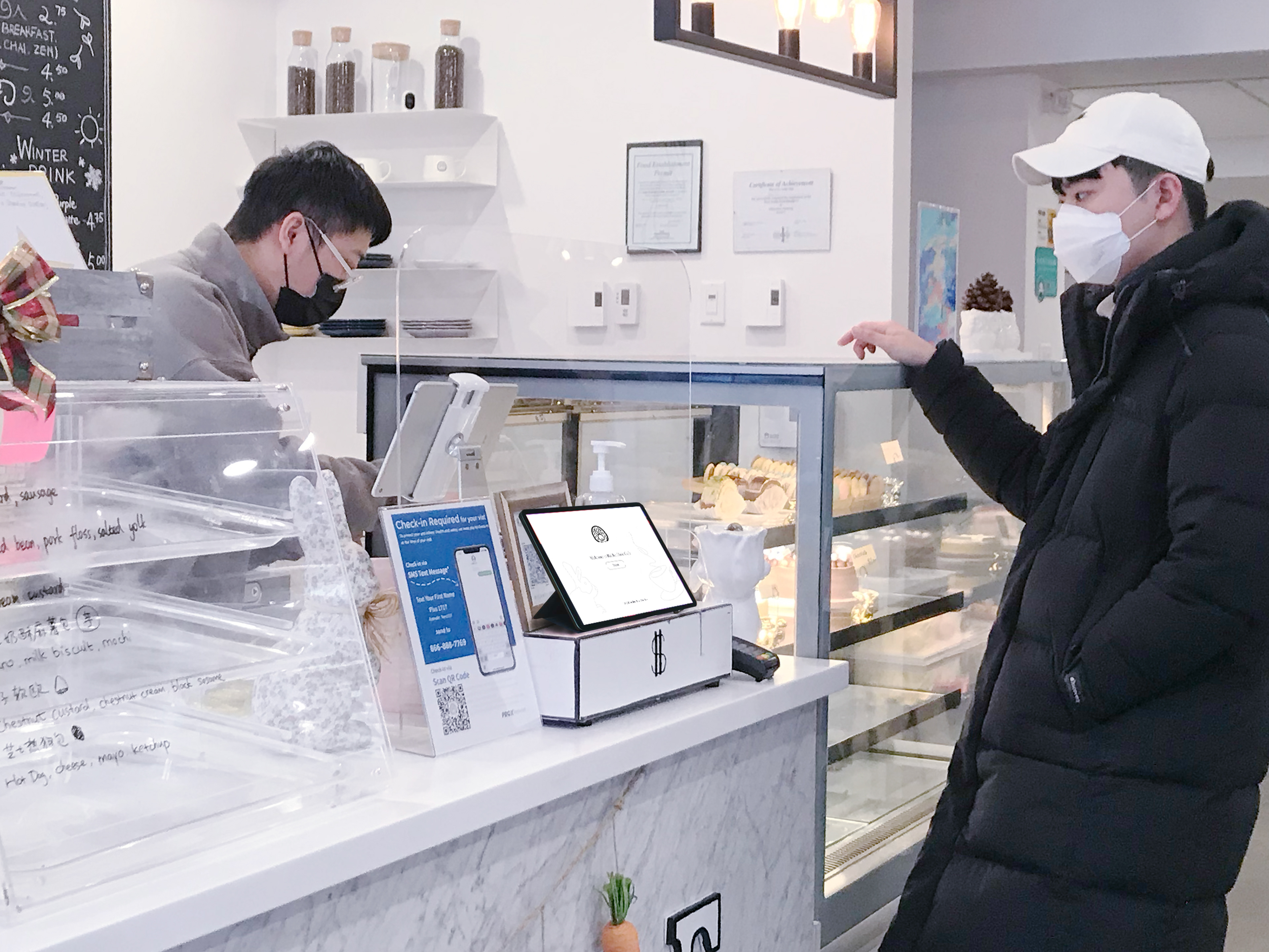
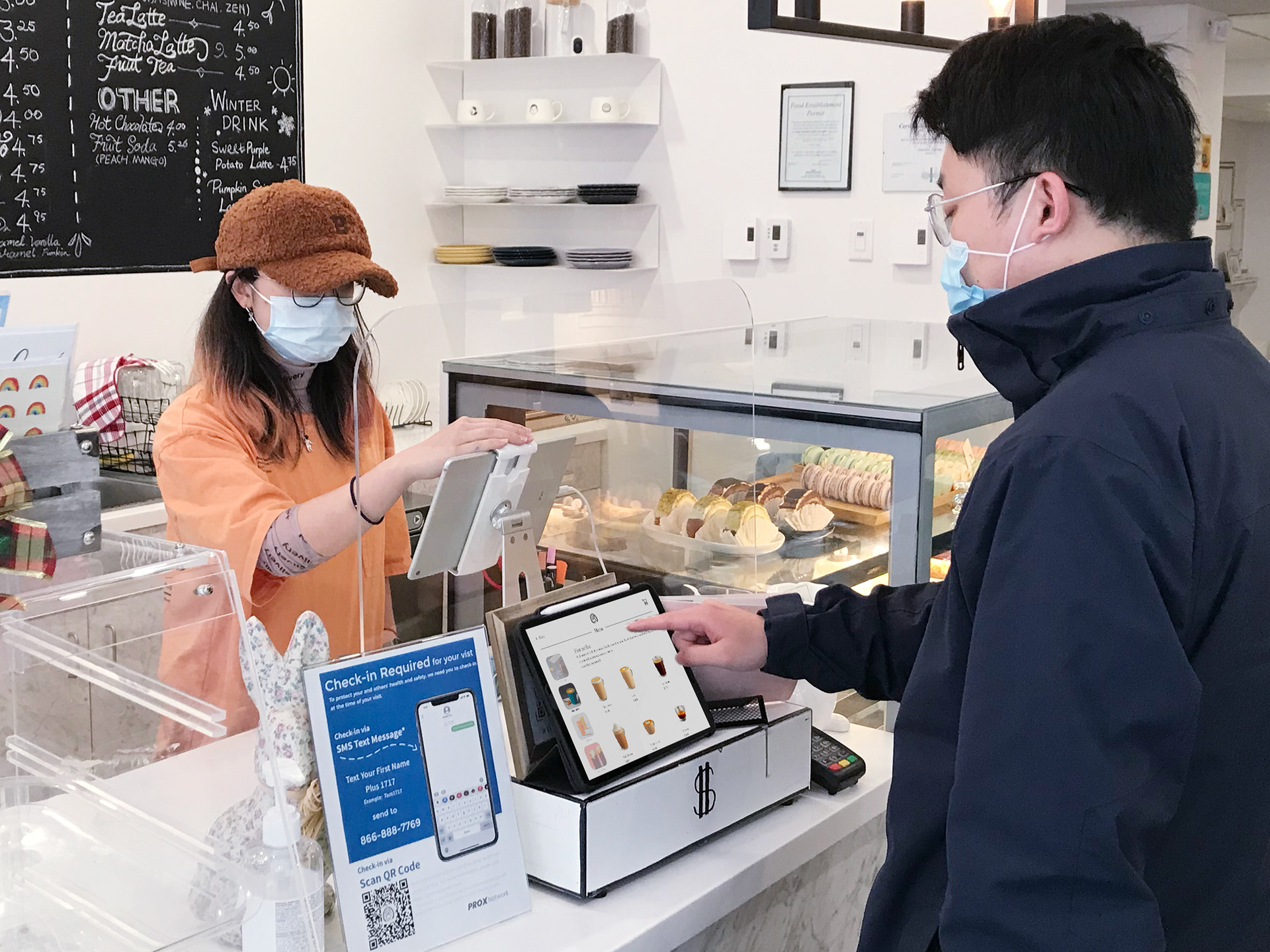
Ordering experience in Rabbit Hole Cafe
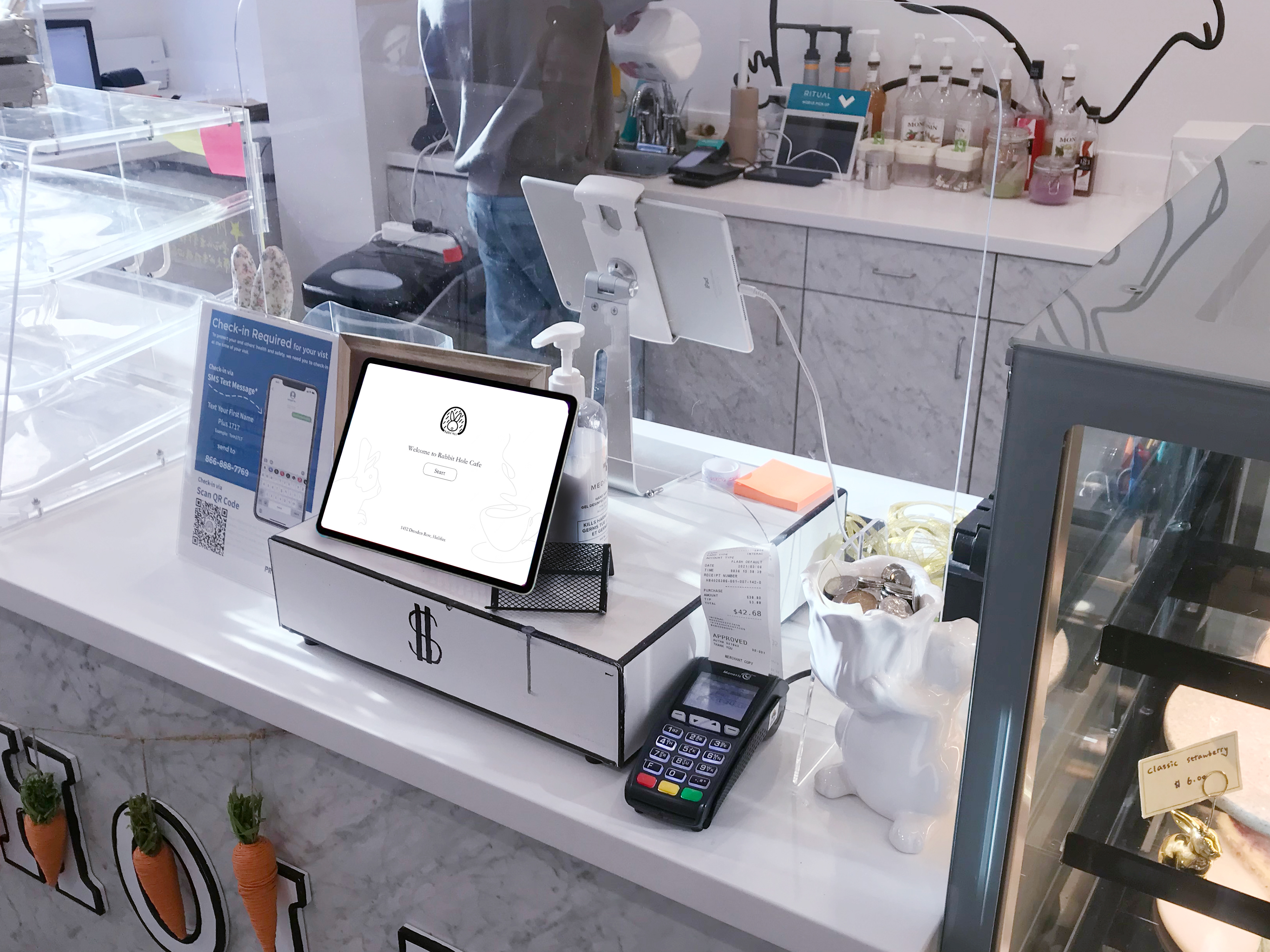
Ordering experience in Rabbit Hole Cafe

What is the value of this app for users?
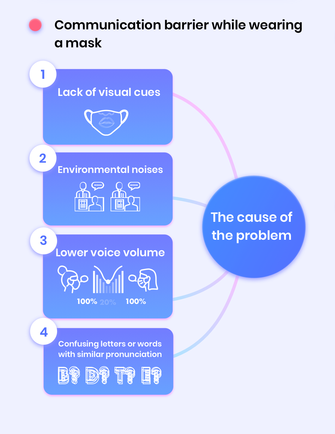
Due to the reduction of visual cues as a result of mask wearing, communication when ordering coffee needs to be visually interactive to enhance information transmission accuracy. Visual communication effectively conveys information in non-speech form through text or dynamic/static graphics and images. Efficient user interface can help compensate the visual cues that masks block to help customers and baristas achieve more accurate information transmission.
Impact of masks on face-to-face communication
What is missing when we speak while wearing protective masks? Human beings mostly rely on being able to recognize other people’s language by hearing and sight. The part of our brain that understands language absorbs a lot of data in order to work out its best guess of what words were said. In other words, language is not only formed and perceived as sounds, but also takes into consideration mouth movements and emotional data (e.g., voice inflections, facial expressions, etc.).
Limitation of face mask
Project participants & Interview

Samantha, customer
Frequency of ordering coffee: Everyday
Repeat: 3 times to clarify
“
Normally I would repeat at least one more time to clarify. I don't think the coffee name is too complicated because it is a common drink, but the face mask cause more communication barrier. I wish they could simplify their menu. It would be nice that we can click buttons to choose what we want
“
As a customer who does not drink coffee, I personally have no idea what to do when I was in the coffee store. I hope I can know what to order; it could be less embarrassing. The summary is confusing. The handwriting is not readable. I don't understand any of the shortcuts, such as "SF, SK..." The experience in a coffee store is one of the reasons I don't like to go there. The process seems too complicated for me.

Yu, customer
Frequency of ordering coffee: None
Repeat: 2 times to clarify

Eric, customer
Frequency of ordering coffee: About twice a week
Repeat: 2 times to clarify
“
I’m not a big fan of coffee. Every time I go there, I would like to have something on the menu and pick the interesting one. I personally have struggled to pronounce the words. I hope I do not have to talk to anybody to order the drink. If there can be some explanation of each coffee, that would help me make a decision.
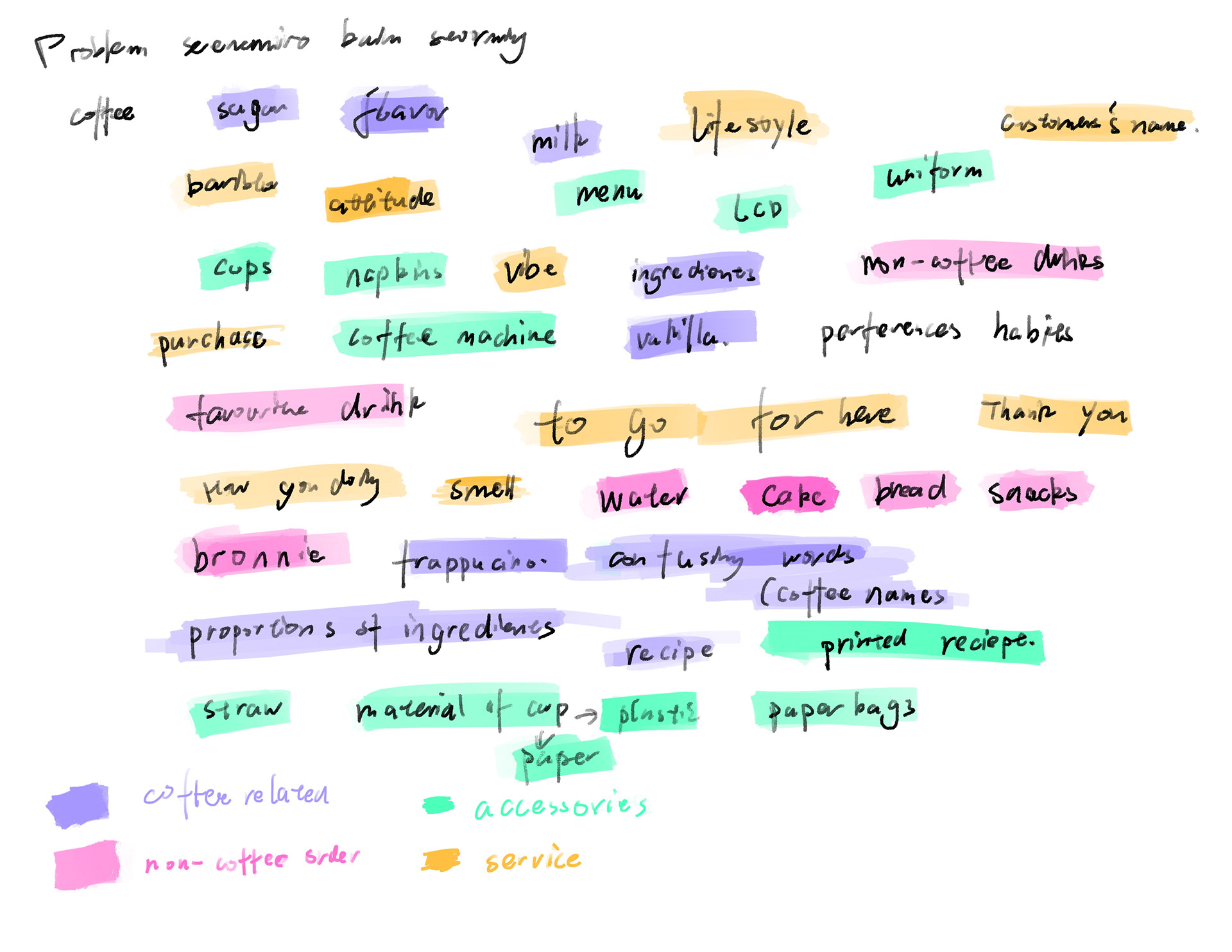
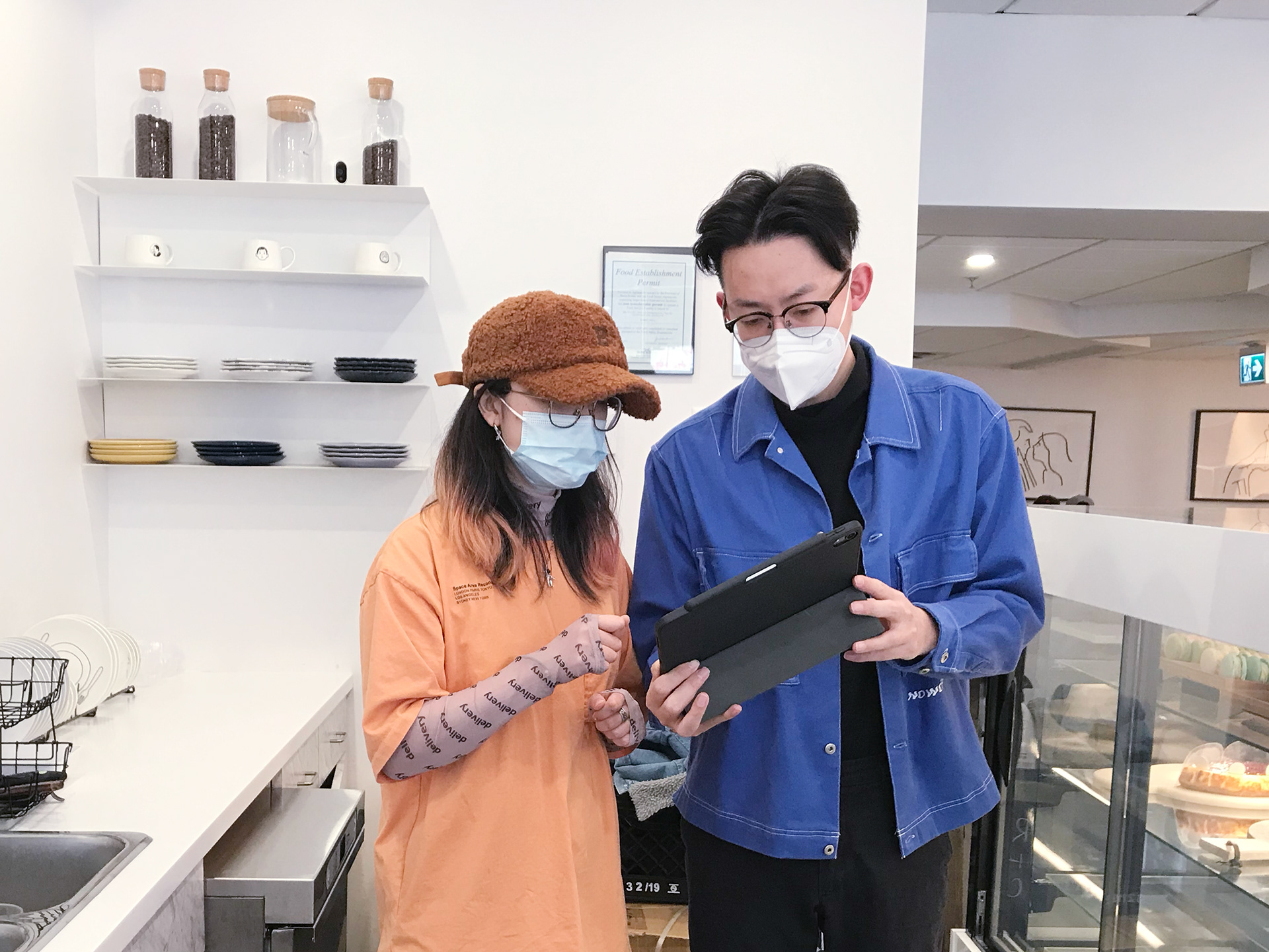
Brainstorming
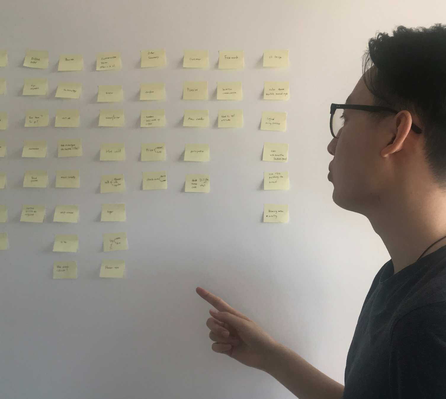

User experience workflow
Through many exchanges and learning scenarios, I worked together with 2 baristas to write a basic workflow to determine how baristas and customers would use the interface and what the process should be (March, 30, 2021).

Wireframe & prototypes
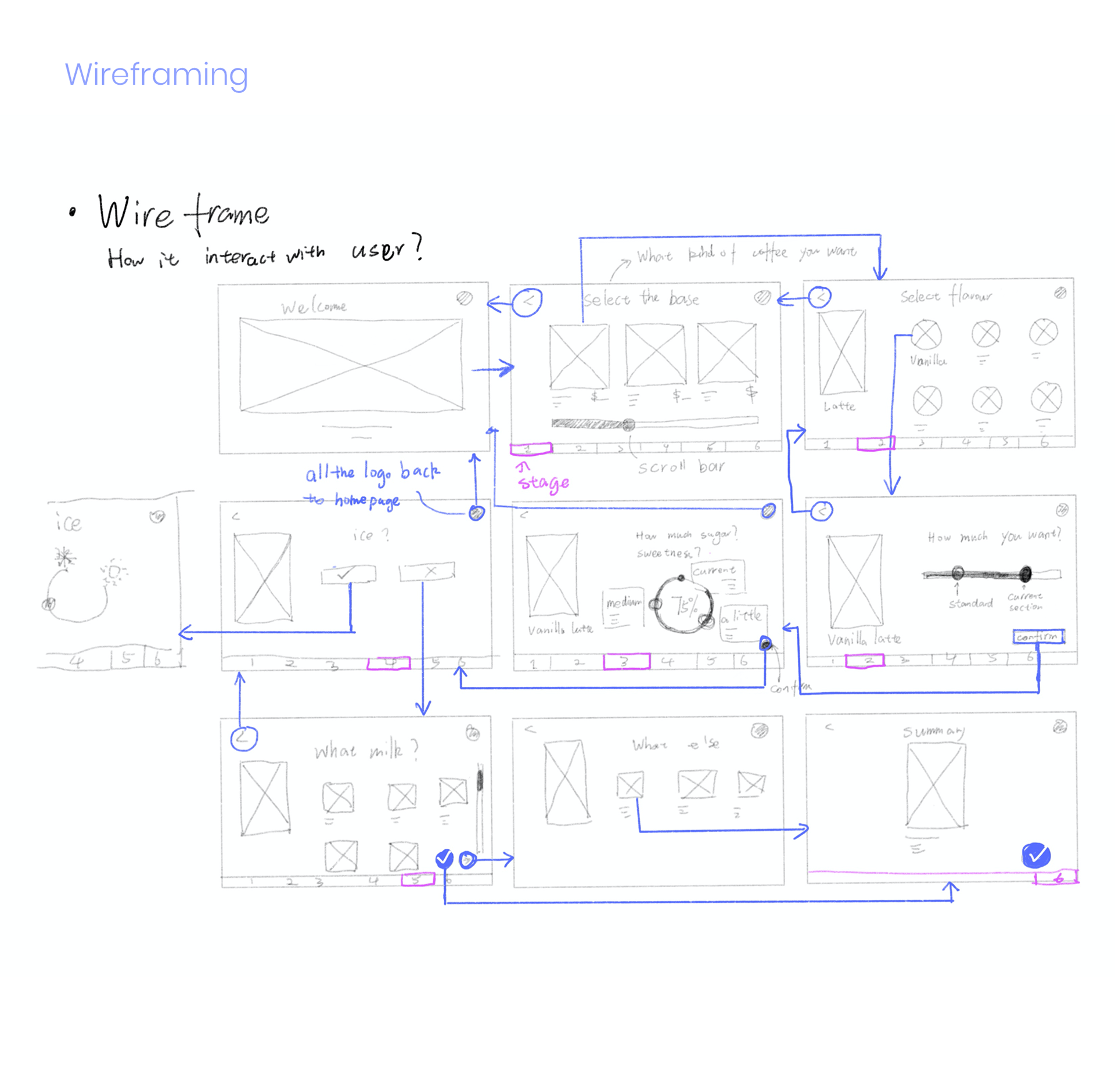
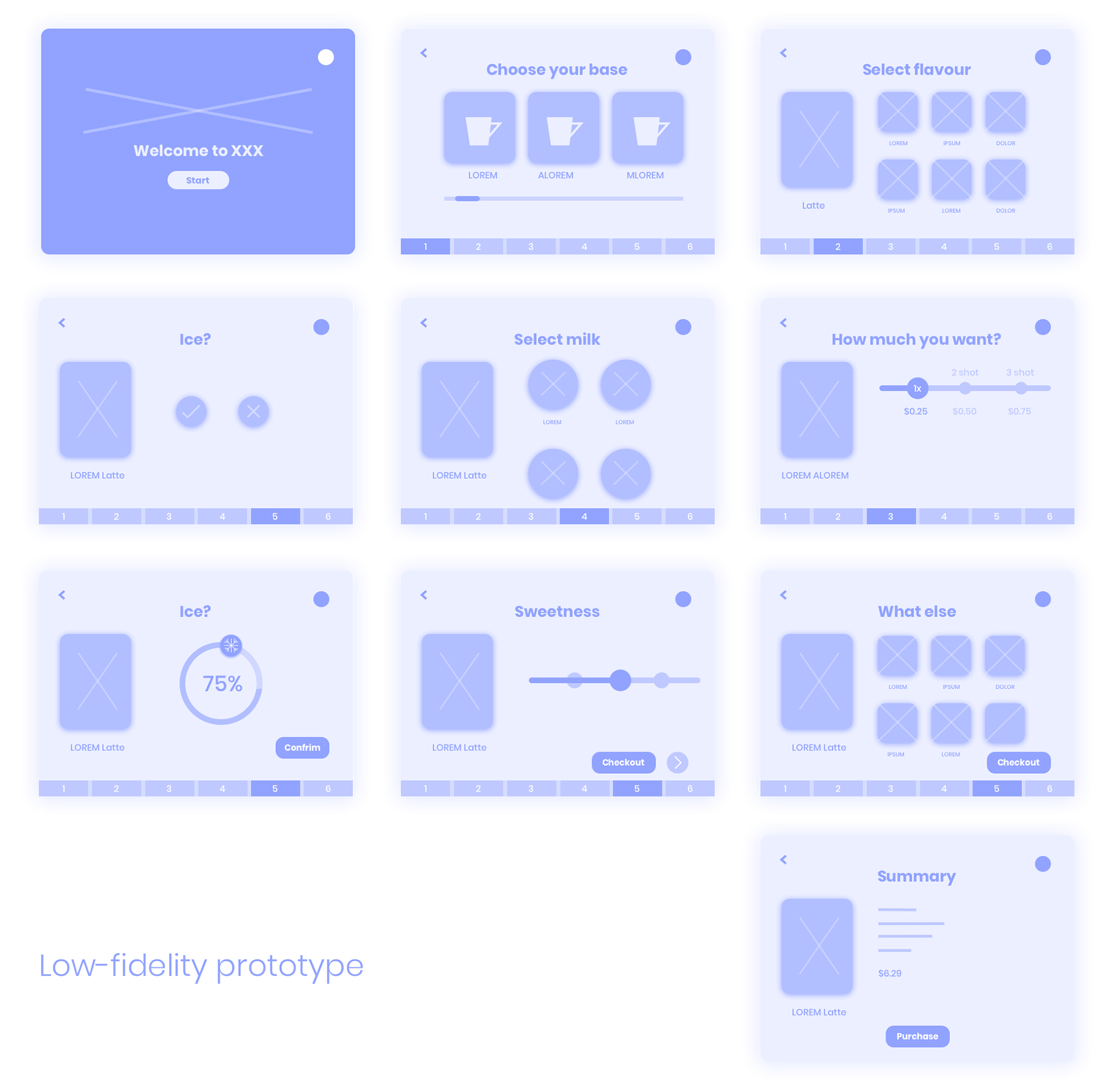

Homepage
The homepage design in this project represents the brand of the coffee shop to show a positive impression and build an emotional connection with customers due to the lack of facial expressions caused by mask-wearing.
Menu
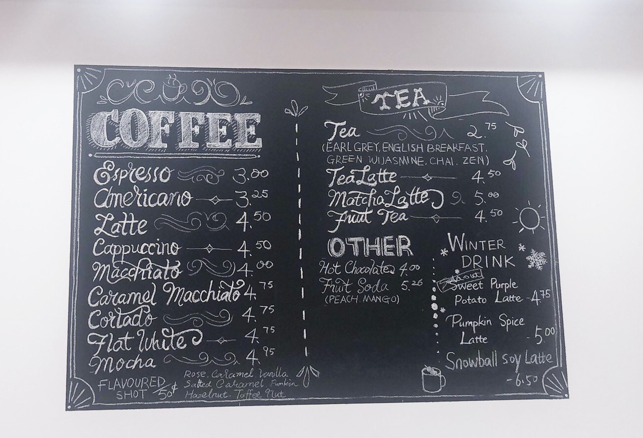
Original In-store menu, Rabbit Hole Cafe
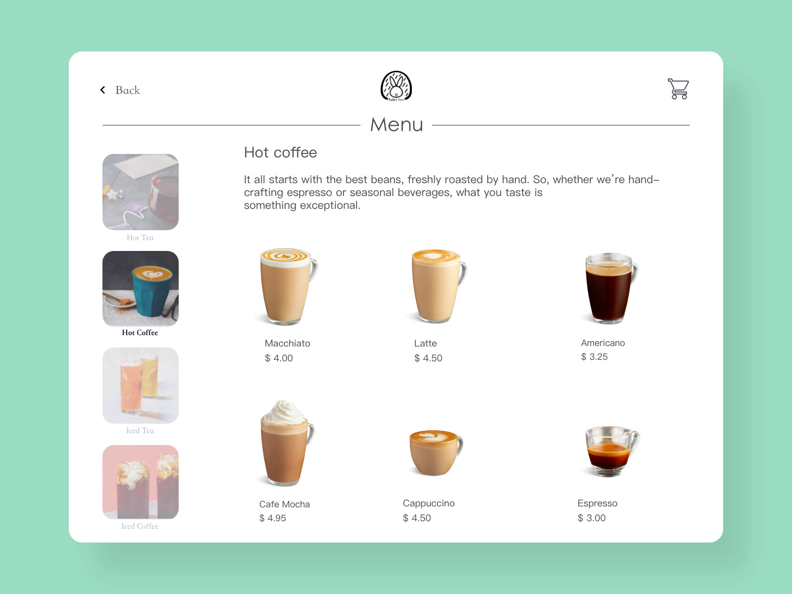
Digital menu with visual languages

A menu with visual languages
Like many local coffee shops, Rabbit Hole Cafe does not currently have a menu with effective visual language (images, descriptions, ingredients). With the proposed user interface, both the baristas and customers can control the menu interface. This is especially helpful for new customers if they are not familiar with the type of coffee in the café. The interactive menu with visual elements can help them choose the coffee they want to order.
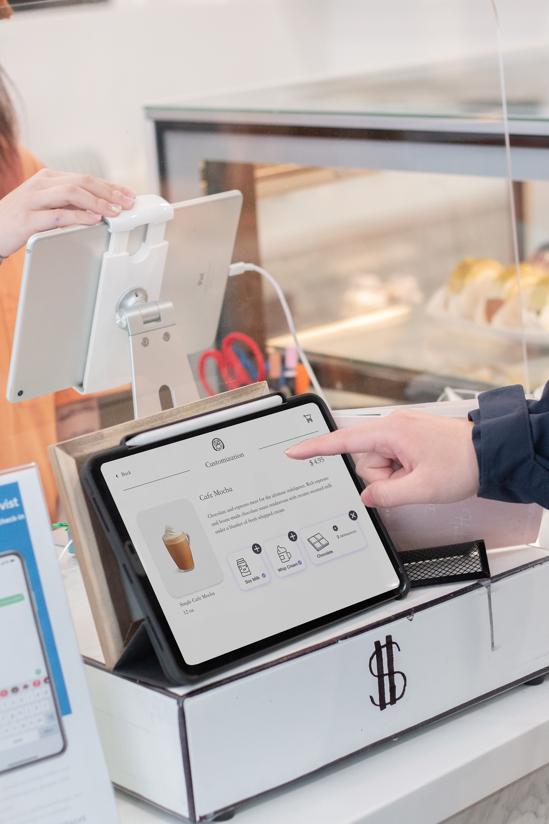
Customization
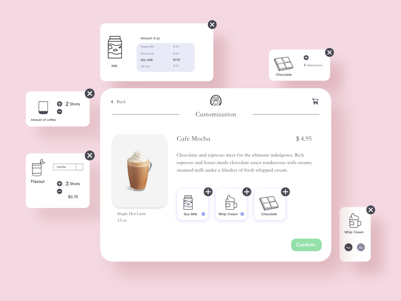

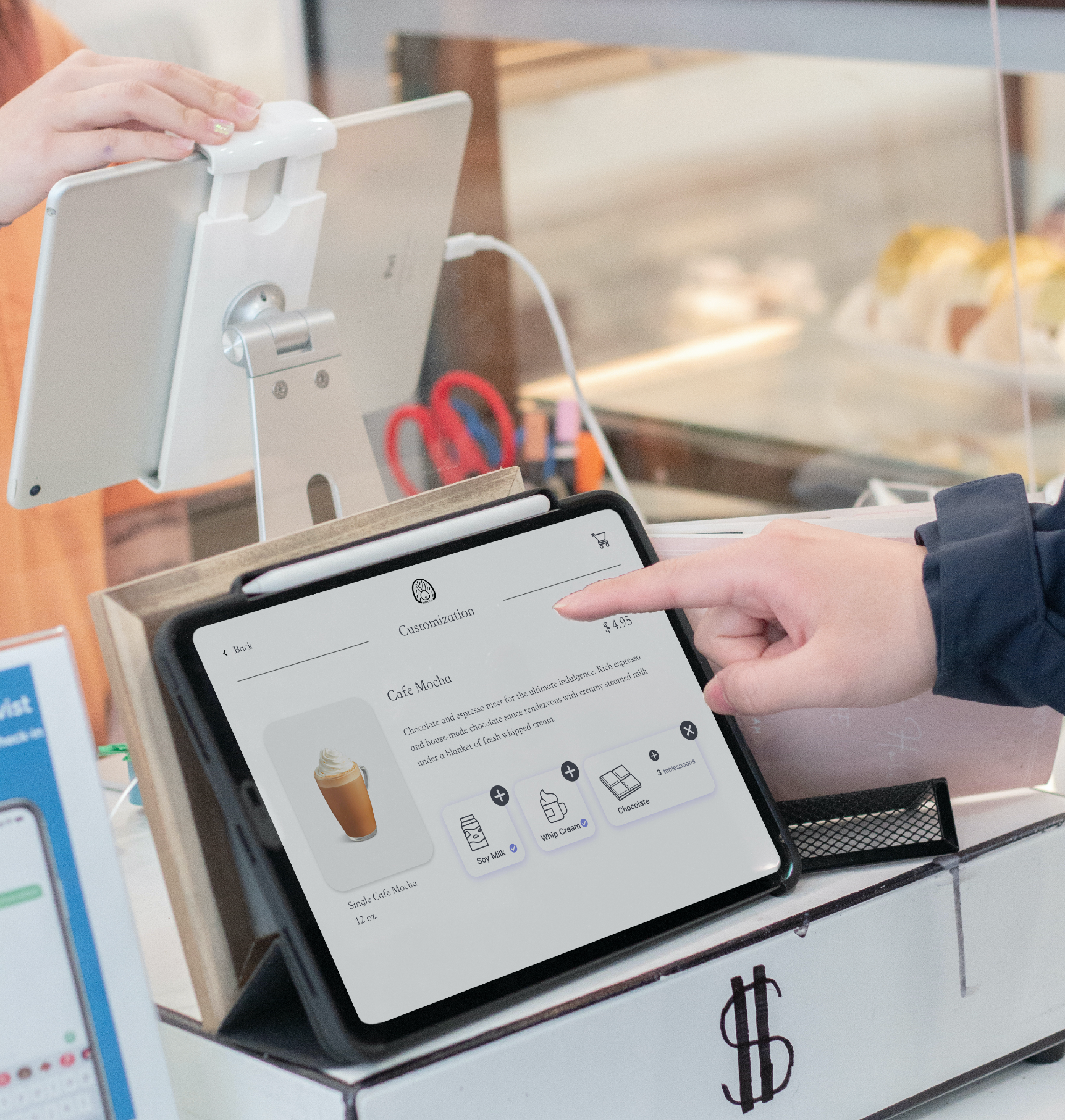
Customization
To ensure the logic and accuracy of the coffee-related information, Baristas 1 and 2 provided the ingredients and corresponding measurement units required for each type of coffee when designing the features of the interface (March 26, 2021). Customers can learn about each type of coffee’s ingredients on this customization page, which is more conducive for new users to choose the coffee they prefer. Users who visit the coffee shop frequently and order the same coffee each time can customize each ingredient or its amount to ensure the consistency of their favourite coffee’s taste.

Summary of the order
The order summary shows all the details about the coffee, including a picture of it, the size, the ingredients, and each ingredient’s corresponding price. The price information will be transferred to the credit/debit card machine by tapping the “purchase” button.
Usability test
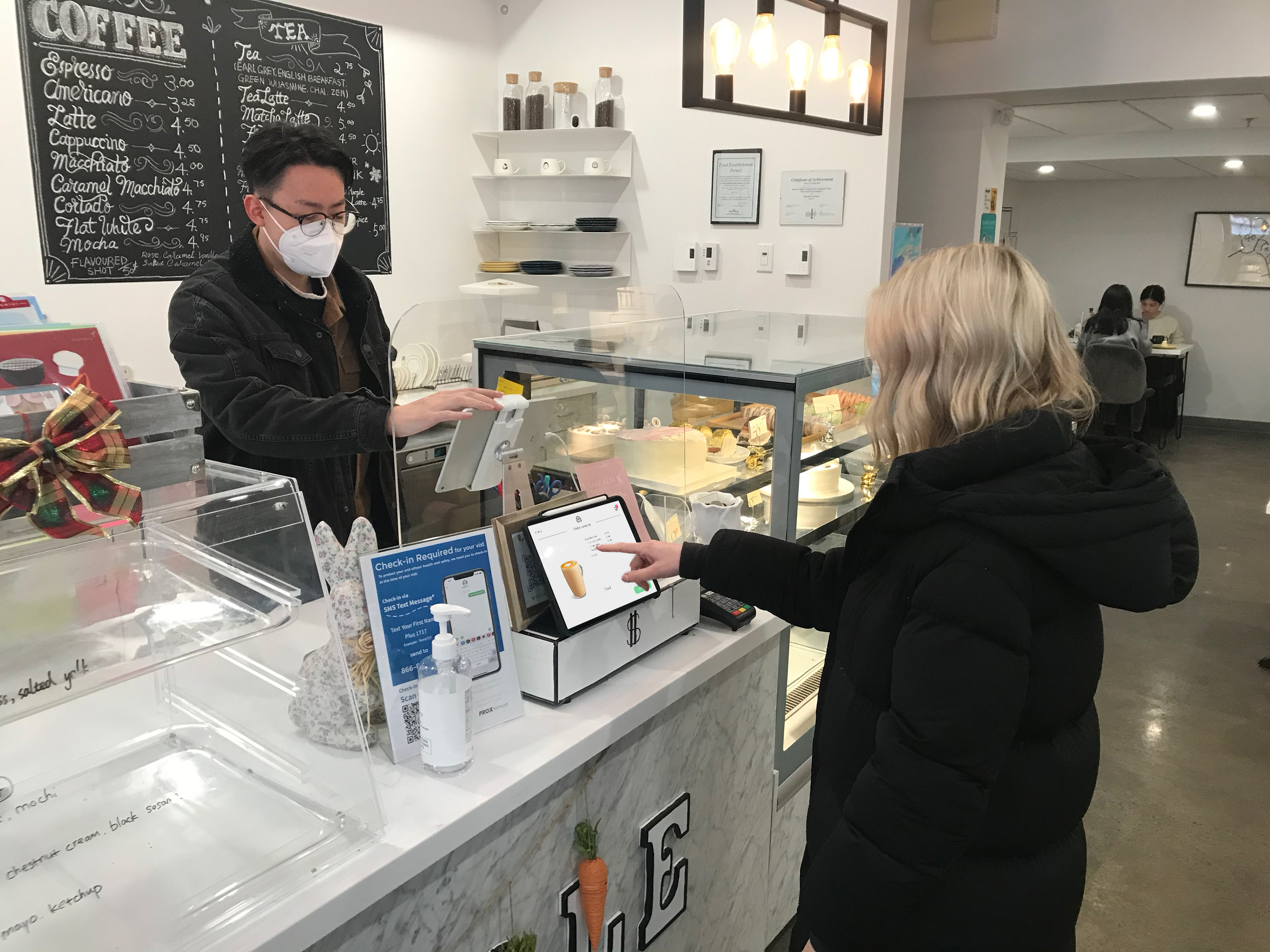
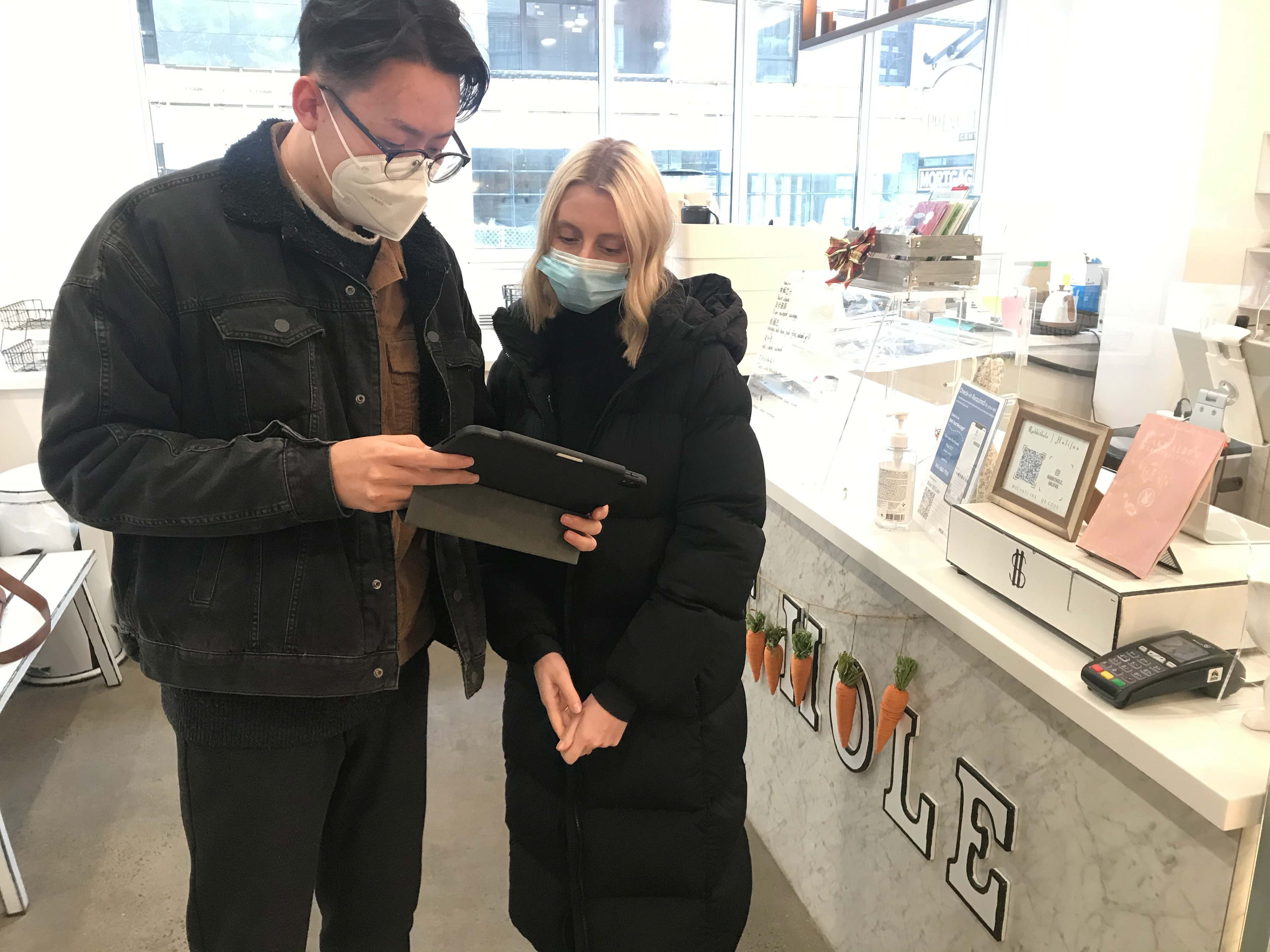
Usability test result
Activity 1 test result
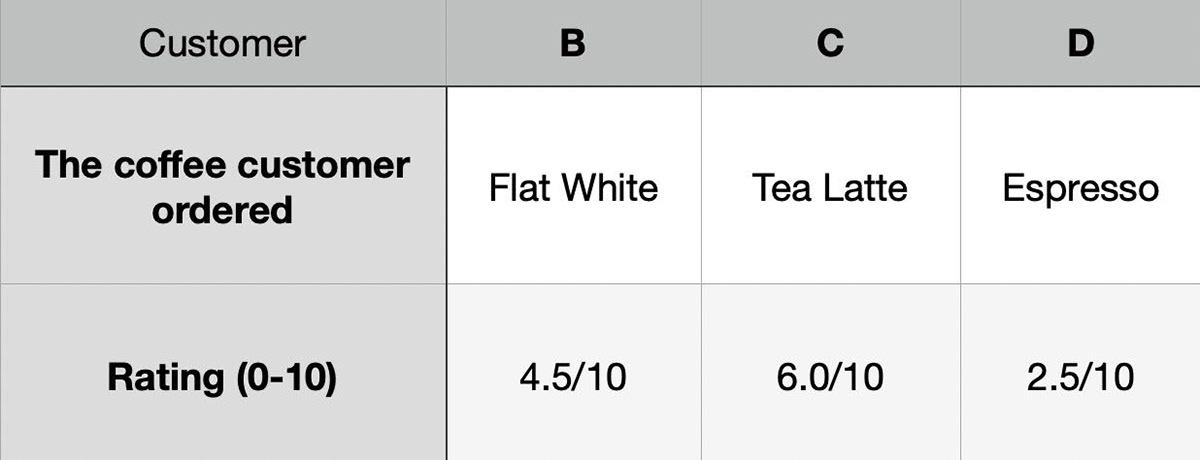
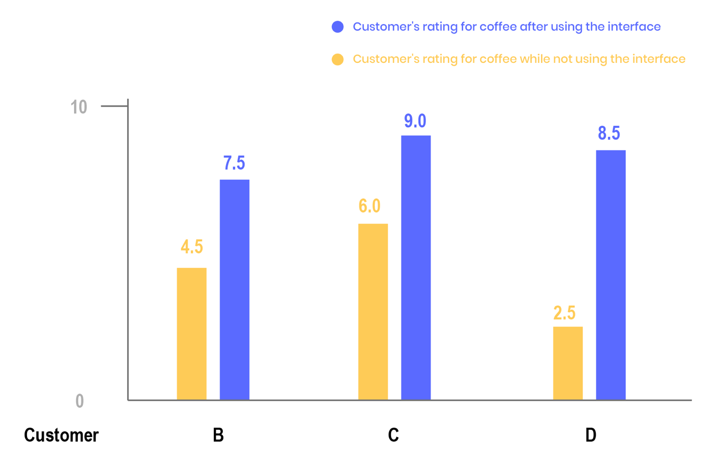
Three participants each order a cup of coffee on the in-store menu without using the interface. The menu only shows the name and price of the coffee. They then tasted the coffee they ordered and rated it from 1 to 10.
Activity 2 test result
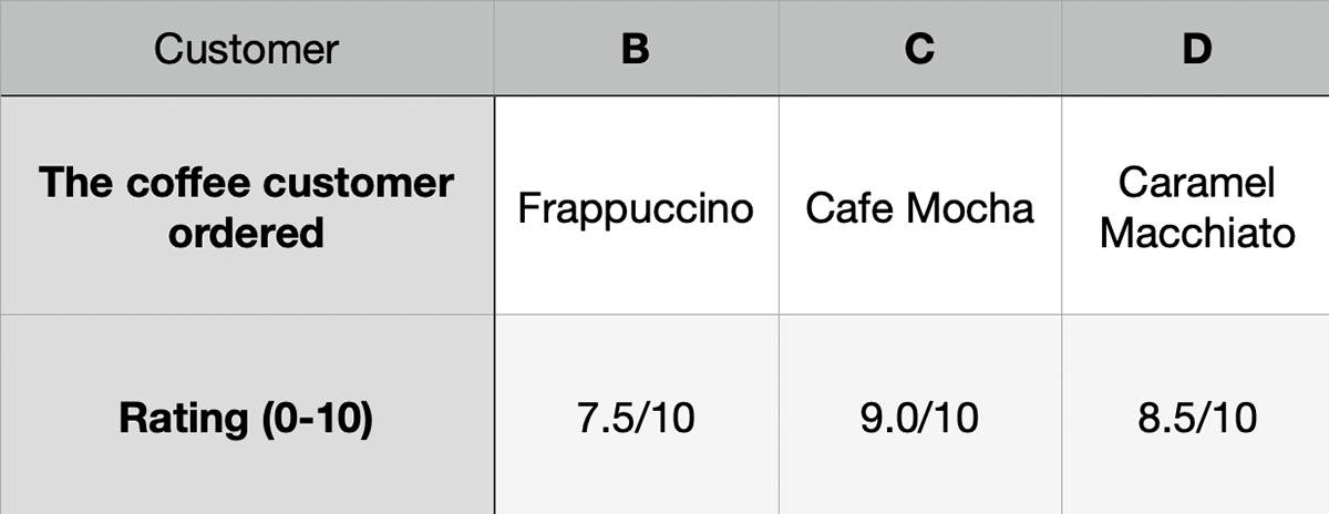
Three participants each order a cup of coffee on the app with optional help from the baristas. They taste the coffee they ordered and rate it from 1 to 10.
Summary of usability test
The coffees ordered by customers B, C, and D while using the original text-only menu are generally low in rating. There are no images or explanations on the original menu. Customers can only choose what they want to drink based on the name of the coffee. By using the user interface, customers B, C, and D rated their coffee higher. Customers B and D shared that the main factors that influenced their decision were the ingredients of each coffee, not the type of coffee.